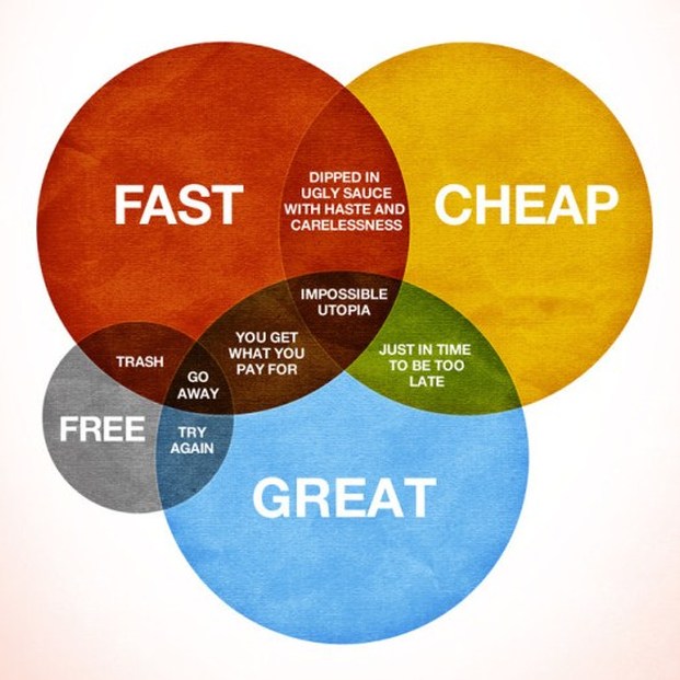
There's an infographic floating around out there that asks, "How Would You Like Your Graphic Design?" While the illustrated concepts have everything to do with output from the graphic design process, they are equally applicable to just about any kind of work product. The original version can be found on Visual.ly, but I've cropped the title off the version below so that you can see how this diagram directly relates to your work and the quality of work you expect from other people. Enjoy!